Mark Bradford enlists other artists to draw up lessons for K-12 teachers focusing on nontraditional methods. The information will be is available for free online.
By Jori Finkel, Los Angeles Times
June 17, 2001 - Artist Mark Bradford still talks about his fifth-grade teacher from Crescent Heights Elementary School, Wilma Chappelle.
The artist known for bringing the gritty, multilayered texture of urban life into painting remembers Chappelle's real-world art projects and her personal support: "She gave me permission — my creativity and my personality."
So he was thinking about Chappelle, he says, when he decided to develop a set of free lesson plans for K-12 teachers that makes its debut on the Getty Museum website Thursday.
The Getty invited Bradford a year ago — shortly before he received the MacArthur "genius" award — to devise a project of his choice with its education department. He chose teachers rather than students as his primary audience, noting that "they need all the resources they can get, especially today."
He brought 10 other artists on board. Abstract painter Amy Sillman asks students to go "on a color tour" of their hometown by noting uses of color in pedestrian things like stoplights. The rather conceptual sculptor Michael Joo asks students to create a prothesis out of everyday materials, after defining the term.
Bradford has students drawing a floor plan of their school cafeteria. On top of that, on another sheet of paper, he asks students to map the social groups using the space. (He suggests color coding, like using "red dots for the cheerleaders," "blue squares for the basketball players" and such.)
His idea is encouraging students to use art as a tool for exploring personal or social issues that matter to them. "What happens so often is you take these multifaceted, savvy kids and give them glitter and macaroni and crayons for an hour, and that seems to them like a hobby, not part of their identity," Bradford says.
"I think that's why Facebook is so popular with young people. I look at Facebook as a collage — you're creating a sense of identity, telling the world who you are, through what music you listen to, what images you like."
No project on the site so far involves Facebook, but the New York artist Kara Walker offers a lesson that has students collaborating on a story by exchanging text messages. And L.A. photographer Catherine Opie asks students to make a self-portrait with any camera available, "even a cellphone."
Toby Tannenbaum, assistant director of education at the Getty, says this use of "nontraditional art materials" is new for the museum. "So much of our work is object-based, drawing from our own collection. But these lessons are really inspired by the artist's own practice," she says. "It helps expand our notions of what can be considered art."
_____________________________
from the Getty OPENSTUDIO website | http://bit.ly/9sc4Dh:
RE-RE-Process
Download Activity PDF
488KB, 3pp.
My assignment for you is in three different parts and will hopefully help you to see more clearly how you feel and relate to the immediate world you live in.
Assignment #1
Song Text Piece: Arrangement/Subtraction
Pick a song with lyrics that you like, then type the lyrics into the computer. Pick a font you like and make the type size 36 or 48, so that it’s big enough to read at a distance, and then print the whole thing out. Cut the words out and arrange them on a large poster-sized sheet of paper. Finally, use scissors and cut out words that you don’t like, or that make you feel bad or uncomfortable.
… if you re-arrange the words out of order, is it a remix?
Assignment #2
Mapping the Lunchroom: Visual Information as Abstraction
Using a large poster-sized piece of paper (24 x 36 inches, for example), draw a map of the lunch room or cafeteria in your school. Consider the architecture (tables, chairs, walls, cashier, etc.). On a second piece of paper laid on top of the map, draw the social groups that form within the space. Also draw how people move through the space. Think about how to articulate the information using color, shape, and line-red dots for the cheerleaders, blue squares for the basketball players, yellow lines for how the hipsters enter and exit the room.
Is abstraction inherently all around us, and is expressing it simply a matter of separating it from the architecture of everyday life?
Assignment #3
Blind Sculptures: Displacing Linear Process, Physical Translation
This assignment is done in two parts: a contour drawing of a self-portrait, then a sculptural translation of the portrait.
With eyes closed, draw your own head (from the shoulders up). Use your non-drawing hand to feel your features from the back of your neck, up and over the skull, across the hairline, down the forehead, and around the eye sockets, nose, cheeks, lips, and chin. Translating touch into drawing usually works best when the pencil never leaves the paper—create this portrait with one long, single line.
Next, translate your contour drawings into three dimensions. Using paper and masking tape, students should use their drawings as guides (paper and tape is cheapest, but you can use anything, really: wire, clay, etc.).
The larger idea is that the choices you make might reveal who you are as a young adult and how you translate your identity into art work.
Everything that you’ll ever need to make art is already all around you. How can these ideas be adapted to something more specific to where and how you live and study?
Remember that these are only suggestions, places to start. If you start to wander, just go with it and see where you end up.
And, of course, have a great time!
Artist Biography
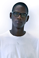
 Photo (detail) by Frederik Nilsen
Born 1961 in Los Angeles, California
Currently lives in Los Angeles, California
As a young boy, Mark Bradford created signs for his mother’s Los Angeles beauty shop. At the time, he did not have aspirations of becoming an artist. Yet the process of making things—and an acute awareness of signage—provided the foundation for a long and successful career as an artist, for which he was named a MacArthur “genius” Fellow in 2009.
Bradford’s art takes the form of installations, video, public art, and collage, and often incorporates found objects, such as signage from his neighborhood, into massive, mixed-media abstractions laden with texture. His mixed-media work is born out of a time-intensive process of painting and sanding, layering materials, and then chipping them away. He takes his inspiration from the stuff of everyday life that surrounds him in South Los Angeles. But he is as much inspired by modernist abstract art and issues of immigration, race, and civil rights as he is by signs, basketball, parades, and maps.
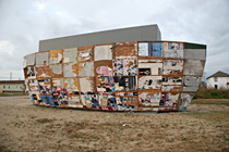
 Mithra, Mark Bradford, 2008. Mixed media, 80 x 40 x 20 ft. Photo courtesy of the artist.
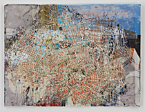
 Monumento, Mark Bradford, 2008. Mixed media, 4 x 5 ft. Photo courtesy of Sikkema Jenkins & co., New York, NY.
other Getty OPENSTUDIO artists/lesson plans:
No comments:
Post a Comment